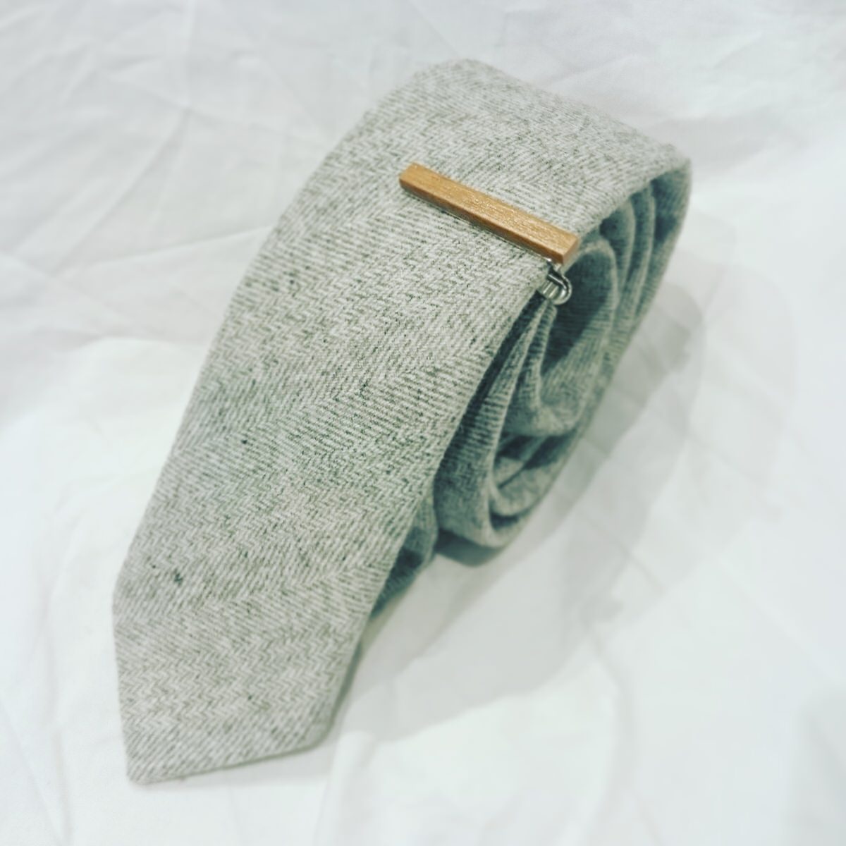
Grey Wool Slim Tie and Wooden Tie Bar
This is a very nice tie, a great neutral colour which would go beautifully with almost any suit or jacket combination. Slim ties are rather ‘in’ right now, and this is a great example.
The wooden tie bar is also terrific: understated but unusual, and compliments the tie perfectly.
Dotted Maroon Knit Tie
Another lovely tie; great colour and pattern, and would go wonderfully with a dark shirt. While C has bad associations of knit ties from a horrid schoolteacher who used to wear them, he still liked this one very much. In fact, he realised that it would have been the perfect tie for a recent concert in which he performed, and was sorry the box hadn’t arrived earlier. However there should be future events for which it will be suitable.


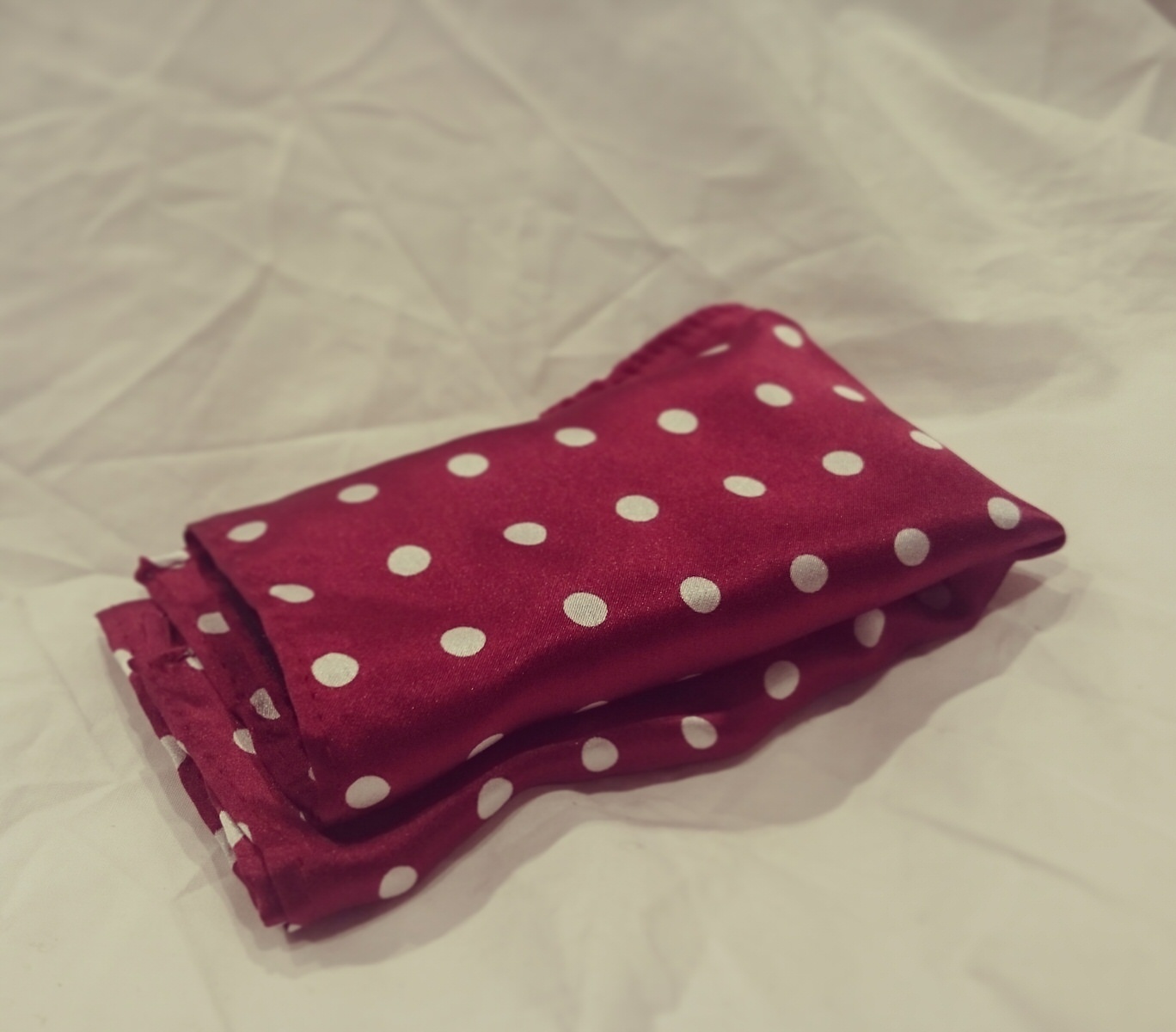
Silk Pocket Square
This was generally approved of. However the one in the box, which matched the knit tie, is different from the one described and pictured on the website. The website square is white with black and navy spots. This would have been preferable, as it would be more versatile, and also would have provided a little more visual variety. However the maroon, as a thing in itself, is just fine.
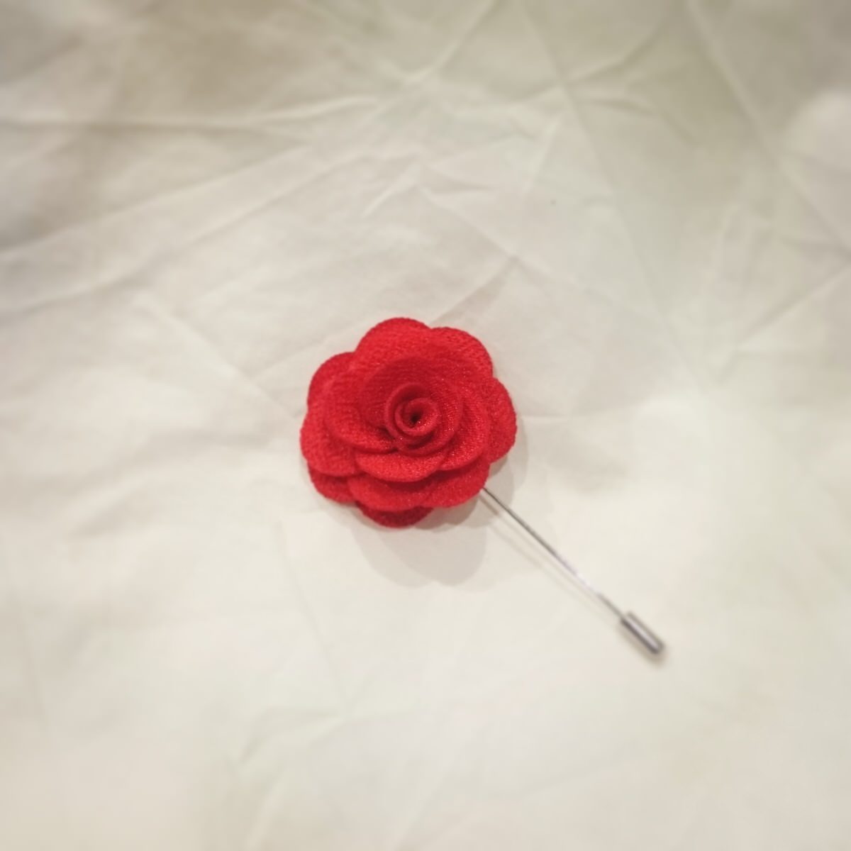
Rose Lapel Pin
This is a charming little thing. I think it would require a certain amount of bravery to wear, as one does not often see lapel pins being worn unless they are a symbol of some kind of organization. However as a splash of colour with a dark outfit it would be very effective, not to mention eye-catching.
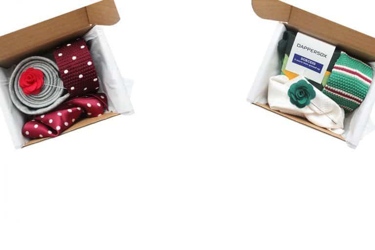
Altogether, the contents are very impressive. So far, so good.
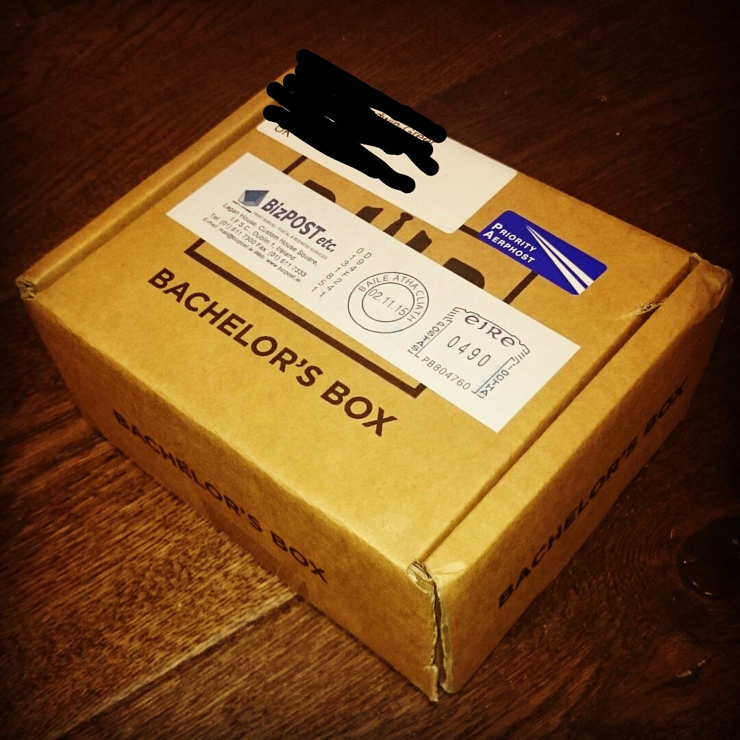
Presentation
This is where things start to fall down.
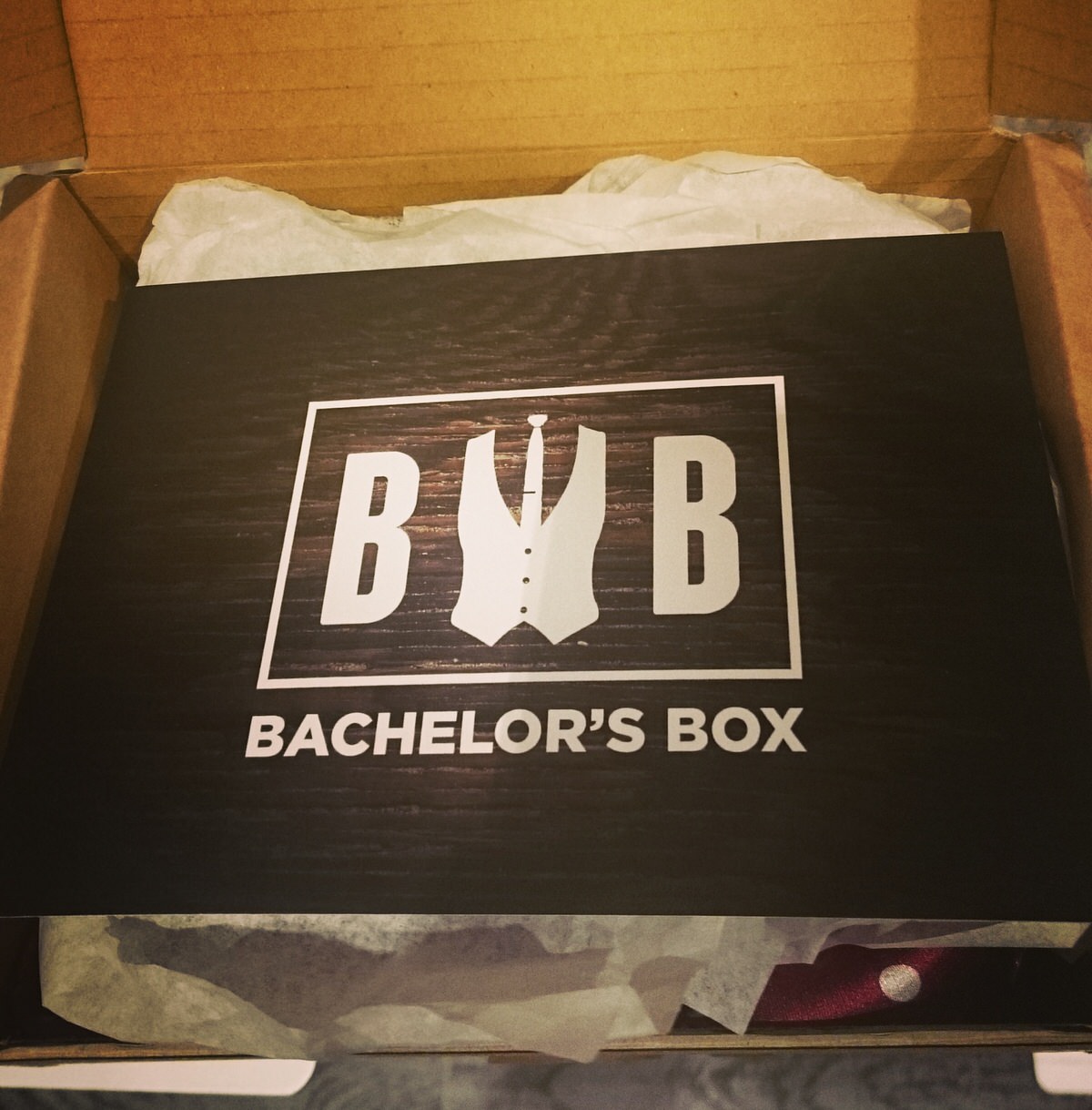
Opening the box, the contents were hidden behind folded tissue (plain white, perfectly acceptable) and on top was what looked like a card with the logo of the company. In fact, it was a flimsy, shiny, cheap-looking flyer. On the back was simply a competition notice to take a picture of yourself with an item, and tweet it to win something. No menu, no further explanation.
For something which is supposed to be classy (and the contents themselves are) this is inexcusable. The logo card should be good quality, with thick cardstock, and certainly not shiny. The website information should be on it (it was on the box itself, but the card should also have this information), and there should have been a proper list and explanation of the contents. This did not make a good first impression.
On the website is a list of the items and descriptions, plus ‘The Story’, which explains the theme of the box, and is as follows:
‘The First Edition of Bachelor’s Box was created as a starting point for men who have either a grey, navy or black suit/blazer. The items were selected as they compliment [sic] one another with their stunning colours. The first edition was also designed to be an introduction to the world of style for men by offering different fabrics and colour accessories.’
Leaving aside the typo (more on that later) this blurb, at the very least, should have been somewhere in the box. While it is perfectly possible that someone who has ordered the box for themselves has already read it on the website before ordering, it is equally possible that it has been bought as a gift, and so this information should have been included. This is especially true for people who may be ordering this as a means to expand their sartorial horizons, and would therefore appreciate a little immediate guidance, rather than having to refer back to the website.
Here is where I’m going to get a little stroppy.
There are some spectacular typos/errors on the website. The misuse of the apostrophe, one of my major bugbears, is seen repeatedly. There is also at least one example of complete nonsense, words which simply do not make sense.
Whoever proofread this website should be ashamed of themselves, as a company which is attempting to create in impression of class and sophistication should not make such elementary errors. In case you think I’m being picky, I’m not, I’m being precise. I always notice this kind of thing because I do some website proofing and copyediting myself. It’s not difficult to get it right, folks, and it looks immeasurably better. Oh, and it’s ‘complement’, not ‘compliment’ (see above).
Another thing, not stroppy on my part, but something which both C and I noticed and thought of independently.
The name, ‘Bachelor’s Box’ somehow doesn’t quite work. Both C and I immediately made the association with the company Batchelor’s, of Cup-a-Soup-fame. Classy it’s not. When one thinks of a bachelor it’s generally as a descriptive noun: bachelor pad, bachelor party. While we appreciate that they have already done their branding, neither of us liked the name, and thought it should be ‘The Bachelor Box’. This sounds punchy and cool. Also, technically a bachelor is a single man, and while this product would certainly not suitable only for the unmarried (it’s made my husband very happy!) the singular possessive somehow seems limiting. This might seem rather a semantic argument, however such a tiny change makes an enormous difference in impression.
This in itself is hardly a deal breaker, but I think it’s important to include.
As I said, the contents themselves are excellent, despite not receiving exactly what was described. One difference that it make was to slightly limit the uses of the various items; the white square would have been slightly more versatile, and also would have avoided having an incomplete ‘matching’ thing going on. In things like this, either everything should match, or it should be entirely eclectic.
Value For Money
The contents are all for sale individually on the website, and prices (in Euros) are as follows:
Grey Wool Tie €20
Pocket Square* €13
Knit Tie €16
Rose Pin €5
Total €54
*the maroon square does not seem to be on the website for individual sale, so I have used the price of a similar square available.
The Tie Bar is not available to buy separately.
This box costs €40 per month, with an introductory price of €35 for the first box. The items, even not including the tie bar, sell for much more than this individually, so all in all, excellent bang for your buck!
The variety of items in the box is very good. I’ve already mentioned about the matching tie and square not being quite as desirable, but this is a small thing.
Most men will have at least one dark suit/jacket, and this is a great start to accumulating an interesting collection of accessories.
Overall Thoughts
The theme, a starting point to a collection, is great. The contents were lovely. The presentation leaves a lot to be desired, and in fact the contrast between them is rather startling.
I will be intrigued to see what they include next time, further expanding the recipient’s collection of men’s accessories. I also really hope they fix the website, get rid of all those bloody superfluous apostrophes, do some blurb rewriting, and rethink the box inserts, both the quality and content. The presentation has lost them a lot of points.
Overall, C loved it, and said it actually made him want to go out and buy a suit immediately. Thank god it was a rainy Sunday afternoon, and besides, I hid his wallet.